Showing posts with label illustration. Show all posts

Thursday, 29 November 2012

A New Era for Illustration

'In the digital future, texts will be annotated visually, animated and illustrated like never before' -Riddell

http://www.guardian.co.uk/books/booksblog/2012/aug/12/chris-riddell-new-era-illustration

Article written by illustrator Chris Riddell , from the Guardian Newspaper online discussing the future of book illustration in the digital era. (Aug 2012)

" As the digital revolution gathers momentum, traditional print publishing is being forced to change. In this new age of austerity, as chill winds blow through publishers' offices, we need illustrators of the calibre of EH Shepard more than ever. And they're out there - look at Posy Simmonds' wickedly perceptive novel Tamara Drewe, David Roberts' brilliantly quirky illustrations to Mick Jackson's Bears of England and Shaun Tan's surreal and exquisite wordless story The Arrival. Like Shepard, these illustrators' work reaches all ages.


As the Kindle's dread grip on digital publishing is challenged by tablet computers and android smartphones, with their bright screens and high resolution, the need for illustration is growing. Newspapers such as the Guardian and the Observer, meanwhile, are expanding into the internet's broad open spaces - spaces with plenty of room for illustration.
At the same time graphic novels, computer games and CGI animation are blurring the old distinctions and categories in publishing. In the digital future, texts will be annotated visually, animated and illustrated like never before. The austere 'prayer book' paper that permitted the space for Shepard's illustrations to Pepys' diaries is now being recreated in the digital era.
It is a space waiting to be filled by today's illustrators. " Chris Riddell.


Similarly this article by Lawrence Zeegen furthers Riddell's optimistic outlook on the illustration industry. (Computer Arts, Issue 174. May 2010.)

"The smart money was always on illustration rising up and breaking free from the shackles of entirely commercially driven projects. A more entrepreneurial spirit has come about, in part due to the fact that digital hardware and software has come down so dramatically in price, coupled with fast broadband/ wi-ficombos becoming standard issue. This has so readily enabled the creation and production, distribution and promotion of images that contemporary illustration has emerged from the shadows to kick-start new self-initiated projects, publications and associated publicity. Equally responsible for the rise in fortune, but far less recognised perhaps, has been the input and impact of a new breed of art and design school educators, who are pushing graduates into a competitive marketplace fuelled with the vision to succeed self-sufficiently."


Tuesday, 27 November 2012

Where have all the book illustrators gone? The Independent.


Where have all the book illustrators gone? An article from the newspaper The Independent.

This article discusses the reasons for the lack of illustrated adult novels in the last half a century  It includes controversial opinions like a lack of decent illustrators and introduces the rise of the inner monologue.


'Up until the Fifties and Sixties it wouldn't be unusual for a mainstream publisher to illustrate adult books. '

'Dan Franklin at Jonathan Cape is one of the few British publishers who bucks the trend. "I think a) it's fashion", he says trenchantly. "And b) there aren't that many great illustrators. It's rare you can come across someone who can draw. Even when you're looking for someone to do book jackets, it's hard to find someone who can draw the human figure – it seems to be unfashionable now."


I fully agree with the fashionability of illustration in books being key to its disappearance but the opinion that 'there aren't that many great illustrators' is, I think, another example of fashion. Why do illustrators have to draw the characters to represent what is occurring in the text?


Simon Prosser, publishing director at Hamish Hamilton: It might be", he says, "that illustration is simply unfashionable. I have a strong, deep attachment to books that were illustrated... I remember from my early reading, the classics of natural history, like Izaak Walton and The Natural History of Selborne and they were all illustrated." Which brings us to another issue, the dearth of publishers with some sort of visual grounding.


Does it matter if adult books are all text? Even the greatest enthusiasts wouldn't say you should illustrate everything. You wouldn't wish on any artist the job of drawing much of Virginia Woolf. But the possibility that illustrations could actually illumine writing and draw out elements of a narrative doesn't seem to count for much any more. And as Posy Simmonds, well-known as a graphic novelist as well as illustrator, observes, illustration can do many things for a novel: "There's lots of choice, whether to interpret, decorate, contradict. It can add to or detract from the writing."


On the change in modern literature:


But there is a problem with the nature of modern fiction. As the novelist Piers Paul Read says, "illustrations are best suited to a novel with a strong narrative, that is to say, illustrating an incident – and there are fewer such novels around.


He (Quentin Blake) thinks that the nature of modern fiction is a challenge, but not an insuperable one. "Once novelists got into the interior monologue... that's what spoiled it for illustration", he says. "But there are things you could do that we've lost the habit of doing. There's a wrong assumption that you're going to draw exactly what the text says. But it calls for a bit of thinking. You don't always want to see what the protagonist looks like. Are you drawing surroundings, atmosphere, furniture? There are ways of contributing to novels. Commissioning drawing, I think, is a habit as much as anything. One doesn't want to say everything should be illustrated. But there are moments when something very interesting could be done. We've lost the habit of thinking like that."


The perception of illustration in books as something for children:


Because illustration is now the preserve of children's books, there's a sense that this is where it belongs, with childish things like comics. Or as Quentin Blake says, "there's a feeling it's not quite grown up to have pictures." Posy Simmonds agrees: "there's a sense that pictures are something you grow out of."


On The Resurgance of the illustrated book in the digital platform:


But it's not too soon to write off the possibility of illustration making a return. And curiously enough, it comes from the very development that people darkly assume to be undermining publishing as we know it: digital technology. Kindle makes the reproduction of colour plates far cheaper than now. As Simon Rossiter observes: "Books are more and more in the digital world – there's a real case for making books more special... it would be great to have a special Kindle edition of a novel." Dan Franklin is even more upbeat: "We'll find in the years to come that there's a renewal of illustration in books. Because of Kindle there's a new impulse to make the physical hardback book a more beautiful object. Illustration will be part of that. And when the enhanced e-book is up and running, it will be part of that too."

Monday, 26 November 2012

Pullman on Boarderland conflicts


Philip Pullman answered questions \about his lecture including, When the artists 'boarderland' conflicts with your own and what happens when your view of a characters is not that presented in the illustration. "It comes down to temperament, whether you connect with the illustration on a deeper level, below the level which we can talk about almost. It's a mysterious thing!"
Also addressed is the change a film adaptation has upon your personal 'boarderland' from the book.

"Reading in the Borderland" Philip Pullman

Author Philip Pullman (His Dark Materials) here presents the idea of what he names 'Boarderlands': the space between the private mind of the reader and the book they are reading.

'Boarderland is different for every individual. Whilst part of the boarderland belongs to the book...part of it is made up and contributed to by and belongs only to the particular reader, to us, to our memories, memories of other books, memories of real places and real people we know, the association's we have with this particular word or that particular style of illustration. Aspects that resonate with our own personal temperament.  So while whereas many readers may be reading the same book, no two people will be reading it in exactly the same way. However we can come back from this boarderland and talk about it, tell others about our experiences about it and compare with their experiences.'
He explains that the boarderland is a kind of Liminal space; 'a state characterised by openness and ambiguity, it is period of transition where normal limits to thought, self understanding and behaviour are relaxed, a situation that can lead to new perspectives.'

Here the author looks at 'semiotics' (if we de-romanticise it) and how we all read everything differently because of our own experiences. 


"Pictures work differently from words, they function like a window. We look through the window, lean on the windowsill, daydream. We send our imagination out like a bird, to fly out over the landscape that someone else has generously imagined for us, and make our own discoveries."
Pullman explains how pictures contribute to our enjoyment of the book: http://www.youtube.com/watch?v=XxS0JUhacug&feature=relmfu


Here Pullman assesses his own illustrations for his trilogy; His Dark Materials. 

Once again we can argue whether these novels come under the umbrella of 'children's fiction' or adults. They are marketed at a young audience and follow the adventures of a young girl Lyra, who a mature audience may find it difficult to relate to. However the themes and event explored within the text are hugely mature (I'm not sure I understood half of what I was reading at the age of 13.) The book explores the links and differences between science and religion, proposing that they are one in the same, which is immensely deep and controversial without the main child characters possibly killing 'god'. The narrative is also very dark (killing god?) looking at a child being used and to some extent abused by her parents and the terrifying soul sucking consequence's of Lyra and Will's actions by the end of the series. It is safe to say that we can firmly position the books not only within children's literature but also in adults.


Pullman Illustrates his chapter heads with a small decorative device that he describes like more of a symbol, each is simple and of a similar style except for the one for the last chapter, Bridge to Stars. 
'What is significant here is what is not there - every other chapter header is in a box with a heavy black frame.' Whereas in this illustration the frame is missing and the style completely different. The style I think is more down to the skill of Pullman in his want to convey an accurate image of Lyra's face: "She's looking out at the universe opening up above her, wondering at the extraordinary spectacle while being daunted by what she has to do  and being simultaneously absolutely determined to do it."
The lack of frame around her face is because, 'All the boarders, frames have been broken open- the whole universe is wide open, nothing is shutting her in.' (literally!) Here is an example of the illustration being more than just a literal visual representation of the text. It is more symbolic. It changes the way in which the reader responds to the text. A 'barrier' has been broken.


On the final illustration in the final book Pullman couldn't decide what to draw that would represent the heart breaking content of the chapter and so, "Abandoned the idea of simple representation becuase the heart of that chapter isn't about the place it is about the feeling...of love and loss. So I was abstract about it...entirely symbolic."
The illustration is not of the characters of the scene but of two roses bound together representing the characters and their departure from each other. 'Will and Lyra are bound together by love but have to face away from each other forever. It is an Emblem not a picture."


"I owe as much to the great illustrators as I do to the writers whose work they illuminated. More than anything else I remember the look of their work on the paper, the sheer pleasure my young-and old- eyes have found in the shape of a line, the delicacy of hatching, the impression of the weight or texture or movement, or mischief  or sorrow, or courage, or joy conjured up by the simple magic of black lines on the white paper. How do they do it? I don't know. Geniuses, all of them. Long live the illustrators! Hoorah for their work!" - Philip Pullman. 

Sunday, 25 November 2012

Do Pictures Pirate Text?

What I liked most about the interviews with Roald Dahl and W.D. Snodgrass was their apparent willingness and enthusiasm to have their work illustrated and engage in the writer/artist relationship. (Which is always nice!)
This paper looking at the role of illustration in the original publications of Robert Louis Stevenson's Treasure Island show another side to this willingness. It is quite opposite to our times (as a general rule) but Stevenson wanted his work illustrated because it would 'sell better'. 
There are contemporary examples of books being sold on the credit of their illustrations, the folio society being the main one, however a book aimed at the best-sellers list would generally be wary of a surplus of illustrations due to current conventions where illustration is seen as somewhat childish or archaic.
The people of Stevenson's day meanwhile would be more than happy and attracted to a book rich in the visuals presented here.


"As another medium for circulating the narrative, illustrations also deserve our attention because of their proliferation and Stevenson's preoccupation with them. In his account of writing Treasure Island, Stevenson envisions his map of the island as the first illustration and as resistant to reproduction.
He worries that artists can devalue his text through inaccurate imitation or revision. Both sources reveal that Stevenson values illustration for improving the novel's sales but also is concerned they contribute negatively to it's status as popular fiction."

Stevenson was still obviously concerned with how the dual discourse of text and image would read in regards to his story but also how it would be received publicly. It's interesting that he doesn't want (bad) illustration to devalue his work to a piece of common popular fiction when in contemporary times the same might be said for illustration in adult fiction to lower the expectation of the texts intelligence or age of its readership.

The dangers and difficulties with a writers work being illustrated are discussed here. From the authors point of view his work should to be key in visualising. The illustrations must compliment but not steer the readers reception and response to the text.


As examined earlier (looking at comics) the primary danger when the book is picked up is not only that the illustrations put off a reader but that the book in Stevenson's words, "be skimmed, swift as a racer, the points seized, the story drained of such cheap virtue as it possesses in five minutes instead of in the tedium of several hours of study."
While this can work well in attracting the audience, invoking interest in the mystery ahead, the illustrations should not tell the whole narrative but give a taste:
"There is nothing more delightful than the first skimming of a storybook with pictures: the faces, the costumes, the strange incidents, the clearness and mystery, the story told and still remaining unknown."

'Expert illustrators must remain loyal to the text, while simultaneously adding their own style: "A picture in a story book must be something more than a mere pretty picture...it should narrate. It should be the handmaiden of the text, competing with another accent and the stamp of a different mind."


Stevenson acknowledges a want and need for illustration but is also wary of it 'pirating' the text. "Illustrations contribute to the text's popularity but pressure the author to create the more memorable versions of the characters and events. Of greater concern to Stevenson are poor quality illustrations that fail to convey the essence and depth of the written narrative."

Stevenson's pirates are unique to us in that they are not the swashbuckling pirates we generally meet in story books and blockbuster movies but are are decaying and weather beaten. And yet as the book is illustrated and re-illustrated as time goes by those characters are generalised into a stereotype we can all recognise.

"The emphasis on deterioration suggests Stevenson is self-conscious that he employs a timeworn stereotype. Ironically, however, his pirates’ ruined forms set them apart from their predecessors (and many of their successors), who typically attract readers with their glamorous, sturdy figures. 
The illustrations frequently ignore Stevenson’s thorough character sketches by instead replicating these stereotypes and inscribing them back into the narrative. "
Once more it is down to the author to "create the more memorable versions of characters and events"


That the text is not only illustrated but re-illustrated is an interesting fact in itself. 
The illustrations tend less to draw upon the narrative and Stevenson's descriptions and more upon copying each other and reflecting the fashions of the day.


"The value of otherwise acclaimed work fades, as different artists’ versions of the same crucial scenes, when viewed collectively, appear to lack innovation."
On the illustration below: "The woodcut employs a common approach to representing criminals: whether they feature pirates or highwaymen, among others, such illustrations send a clear message that their subjects are based on a generic figuration of “the outlaw.”


Wednesday, 21 November 2012

A working partnership with DeLoss McGraw

The poet W.D. Snodgrass talks of his working relationship with painter DeLoss McGraw.
He touches on how both artist and writer occasionally misunderstood each other and their individual ideas and interned responses which in itself is interesting but also explains that the artists work is based on a lifetime of experiences and knowledge that he draws upon draw upon unconsciously, much as we as culturally/historically aware readers do when we 'read' an image.


 DeLoss McGraw

Dahl & Blake

Roald Dahl & Quentin Blake

Its is not often that you hear Roald Dahls name used without the mention of his close friend and illustrator Quentin Blake, such is the iconicness of their relationship and of their visual 'brand'.

What is interesting in this pairing is the complete trust and intuitiveness with which both artist and writer viewed each others work.
"While working on the BFG in 1982, Dahl even altered his own written description of the friendly giant so it fitted with some of the drawings Blake had already made. In the storyteller: The Life of Roald Dahl, Donald Sturrock says that Blake was able to almost intuit what Dahl's characters would look like. "Quentin began to realise just how precisely Roald imagined his stories," he writes, "Initially, Dahl had described his character wearing a black hat, apron and large black boots. But when Roald saw Quentin's drawing, he knew at once that the giant needed to look softer and more loveable."


That Dahl changed his narrative after seeing Blake's illustrations in key in discussing how a relationship like this works and that unlike many re-illustrated volumes, illustration had an equal position to the writing:  "Dahl was adamant that his text be full of illustrations, "What was so nice about Roald was that he actually wanted the pictures," Blake recalls on his website. "He didn't like it if there weren't enough."
While this is unfortunately very unique of authors (and more frequent in children's literature) it shows that the narrative and illustrations were intended to be read together, in a single discourse.

Blake on illustrating:
"Blake's job was to convey their many unappealing traits in pictures. (the Twits)
Early on in the story, Dahl describes Mr Twit's beard as being lodged with bits of decaying food. Conveying this in a single portrait image was difficult  so Blake drew a 'magnifying glass' as an in-set illustration, which zoomed in on the hairs and the morsels of sardines, cornflakes and gorgonzola contained within.  It was he says, a question of "how do you enlarge the text slightly, without contradicting it?" Blake added further visual elements too which, while not taken directly from Dahl's text, were pitched as if they were."
An example of extending the narrative, mainly through disgust. Blake could have chosen to draw a portrait of the man purely as a representation of what is written, instead he gives us this close up which acts to heighten our dislike of a foul man through its stomach turning imagery. (Which kids love!)


Quentin Blake on Illustrating The Twits.

Like the collaborations between Thompson and Steadman a brand has been created with the style, typography and interactions between text and image. Both artists are synonymous with each others work.


Blake on his process and collaboration

Tuesday, 20 November 2012

Make Real Through Fictional Presentation

Looking at an example of an illustration which accompanied a Victorian newspaper article about homelessness it is interesting to note that at the time photography was a used and functional medium and yet an illustrated presentation was preferred to sit alongside the text.
 "Yet this should not surprise us in an age when many find the dramatisation of recent events in  fictionalised on television or film accounts -of the holocaust say, or of the hostage crisis in the Middle East- more acceptably 'real' than factual and scholarly accounts." - Stuart Sillers, Visualisation in popular fiction.
In these cases what is happening is the use of a single dialogue of the text and illustration to 'make real through fictional presentation' a truth of contemporary reality that is otherwise difficult to grasp in human terms.


In the text accompanying this illustration, the author uses characters to describe the facts and situations of those people living on the streets. However it would seem that these characters are invented, the author is giving life and story to those he sees that the illustrator has presented. 'The fact that the characters are invented and given fictional life stories makes the scene more real to the reader.' We can sympathise with them, if not identify. That we now know of them 'personally' and not as just someone in the street we know nothing of, makes us care more about them, even though these particular people are not strictly speaking, real.

"We are taken along to the asylum with the central character, and approach it through her eyes as much as through those of the omniscient narrator. There is effectively a dual viewpoint, allowing us to both experience the asylum as does the central character, and also to recoil from it in horror."


Dickens


The most striking point in this quote in which Dickens discusses the actuality of life in the London slums from the preface of Oliver Twist is that "Dickens assumes without question that the 'reality' of urban vice and squalor is that which is presented by Hogarth - a statement of 'truth' of the image which reveals much about the impact of the earlier artist's work upon the writer and also of the larger power of the transmitted vision of the truth rather than the external truth itself at a time when engravings were the major source of reproduced visual data."

People are more willing to take presented visuals as truth when accompanied by the text than they are the reality which they may not be aware of or just unwilling to accept.
 The difference is that there is an involvement occurring between the reader and a text or image, they are being presented something which they can then use to recognise the world with and because they have read the text/image have (secondary) experience with and so take that as truth. Its almost like having a preconceived opinion about someone before meeting and getting to know them.

Monday, 19 November 2012

Homles & The Hat.

Every once in a while an illustration can be presented alongside the text and become iconic even though it is a narrative departure.
 The public view of the character Sherlock Holmes is inseparable not only with his friend, Watson, but also with his hat. The deerstalker. And yet Sir Arthur Conan Doyle never once described Holmes as wearing one throughout his series of novels. 
This depiction comes from the illustrations by Sidney Paget, originally published with the narrative in the Strand Magazine 1880's onwards. (It is of interest to note that as this is a 'countryside garment' the illustrator only showed Holmes wearing it in appropriate rural or travelling scenes and never in urban London.)

It is fascinating to see how such a narrative departure has produced one of the most iconic images of a character in fiction and perhaps without even having an illustration present in the text, changed the way in which we read it. The hat has been absorbed into our shared idiolect.


Sidney Paget


To quote the current BBC adaptaion: "It's not a deerstalker anymore, it's a Sherlock Holmes hat... you're this far from famous"

The Maiden Feeds The Tree Beasts & The Whores' Asylum


This illustration for 'The house in the wood', a Grimm tale is highly stylised, "It is heavy and naturalistic: there is no hint in the style or treatment that this action is the turning point of the story, or that the maiden's actions will have magical results."
The heavy black frame and archaic style of the illustration distances the reader and is enhanced by the placing of the elaborate caption. 

"Even though the main lines are curve...the overall effect is one of formality and restraint, to match the writing. The result of this is to suggest distance and separation  the rhetoric of the image is a constant reminder that it is an aesthetic construct, and no effort is made to engender imaginative involvement in the child reader."


As a contemporary audience we are fully aware of the age of the illustration, which in turn makes us age the text similarly. This changes the reading experience. No doubt the style of the text(thou, thee) would have alerted us to its age as we read it, but having the image present changes the way we perceive it from the start or even before we read it. As to whether this changes our perception of the text for better or for worse is largely subject to personal opinion, but the fact that we even address it is, in itself, a distraction.
It is interesting therefore to look at contemporary novels that use illustration styled from there archaic eras for the covers or even inside of their books. 

'The Whores' Asylum'

A recent example of this I found is a book called 'The Whores' Asylum by Katy Darby', which sounds charming but there you go.
 The novel is set in the 1880's and so is based in the era that 'Sherlock Holmes' would have been detecting in. 
The author writes;  "..the thing is, it was Sidney Paget's wonderful illustrations for the stories when they originally appeared in the Strand Magazine that really brought Holmes, Watson et al to life. And what would be more appropriate for a Victorian novel than an exquisite series of bookplates to accompany the narrative?"


On aproaching her publisher, "I suggested, in a throwaway fashion, that it would be amazing to have some pictures of key scenes scattered through the text – it's a typically 'period' thing, so would be very much in the spirit of the novel."

"All I had to do was go through the story and find some of the most visually dramatic scenes, then sit back and wait for them to be turned into fantastic Pagetesque black-and-white line drawings. I also had to comb the text for physical descriptions of the various characters..."
I find it interesting that here the author is suggesting scenes to be illustrated and I guess a discourse continues between author and illustrator during this process.

"I'm not one of those writers who has a crystal-clear picture of their characters in their head from the outset; I tend to build them up from the inside out....Who did he look like? Himself. What did that mean? I didn't quite know – but I was aching to find out.
...The above, at any rate, was how my characters appeared to me and therefore in the text – but I didn't set to writing with a gallery of detailed portraits floating before my eyes. I was open to however the artist decided to render the people in my book, because I love having my work illustrated. There's something about seeing your characters afresh through somebody else's eyes that's completely intriguing and revelatory."
That the author herself doesn't have a clear view of the characters in mind is a slight relief. I am not sure I ever have a solid image of a characters face in mind when I read a novel, I tend to characterise them by just that, their character. (This is not helping my argument one bit!)
However I then question her decision to ask for the characters to be illustrated, yes like she sates it is 'intriguing and revelatory' (and its the result I'm routing for), but that is only to her. A reader fresh to the text will not know the characters before the conception of the illustrations but will read them both simultaneously. Does this mean that their perceptions of the characters differ to that which the author 'saw' them as. Or is she happy for this inferation since she herself doesn't have a 'crystal-clear picture' of the character in her head? 

"I was sent roughs of seven key scenes from the book, ranging from a formal ball to a strangulation, via a duel, a naked lady being painted, a prostitute soliciting in a dodgy tavern, and a masked orgy. Lucky Max (illustrator) had to deal with some more of my authorial objections as I pointed out that the tart looked too prosperous, the artist probably shouldn't be wearing a cliché – sorry, beret – and the duellist holding a gun in his left hand is actually seriously injured on that side. However, in my defence, the reason I was so pernickety about the content of the illustrations is that each one is on the facing page to the scene actually described – so the reader having just read about one character's arm getting maimed would definitely be puzzled to see it whole again in the picture opposite."
Here the author makes sure the illustration does not distort the text in performing a major narrative departure and in so distract and thus distance the reader.


In this example of a contemporary novel illustrated in a bygone style it is the authors wish that the readers experience of the book be been highly influenced by the illustrations. She wanted the book to feel like a classic, like a Sherlock Holmes. Therefore this is a case of using illustration to distance for a specific reason, for a specific experience.

Katy Darby's full account of her relationship with the illustrator can be found here on her blog.

Sunday, 18 November 2012

Serial flicker.

I recently attended Thought Bubble, a comic convention in Leeds. I was stood talking with an illustrator flicking through one of his comic books when he told me to stop because that was the last in the series and I would ruin the ending for myself if I looked at the last few pages.
 It got me thinking about how I often have a tendency to do this with novels (and with comics because I'm an idiot) I have no idea why. But it struck me that if there were illustrations in it I could very well ruin the book for myself if they were explicit enough to tell me the story. Then again with a lot of illustrated YA books that I used to read I would purposefully do this just to see the illustrations and I guess in a way try to figure out where the story was going.
(I feel I'm in the difficult position where I'm such a visually aware person that I struggle to guess what the general population would do. I can't wait to see all the drawings but they might just read it normally.)

As in illustrator would you factor in the possibility someone (or even most people) may flick through the book before reading or even buying it? Would you make sure none of your illustrations were explicit of the story? To have an image of the main character with their head chopped off at the end of the book would surely be a huge risk.

I've looked at the idea that you could place an illustration too far forward in a narrative and thus change how you read it but I hadn't considered the freedom of the reader to look forward in the physical book itself.

 Is this a point down on the illustrated novel side or just something else that the illustrator need be wary of?


Chris Riddell

Extending the Narrative.

In the image of Little Nell's death the narrative is extended through metaphors by (in a paradox) altering the narrative of the text. The illustration is contributing to the continuum of the narrative and so alters our reading experience.

The placement of the illustration within the text can also extend the narrative and change our experience of the reading the book. 

On little Nell:

"Coming at the end of the chapter, it provides us with a moment of stati, of contemplation, in the face of the death f the character. That the engraving is placed sideways in the original edition, with the consent and to the satisfaction of Dickens, is also significant. We have to turn the book around to take in the image, and in doing so we suspend the continuum of the verbal discourse. The presentation of this moment of stasis within the text is only one function of the image, which also extends and deepens the verbal text in ways explored above." -Stuart Sillars


The placement of an illustration therefore is almost as important as that which it depicts. You may want pauses in your text for contemplation, to build tension ect. but you do not want to give away too much at the wrong moment. If the illustration of Little Nell were to come before the end of the chapter interrupting the text, then you'd be forced to stop reading unnaturally and wouldn't necessarily have the moment of reflect or perhaps even the understanding of what is presented. Furthermore if an illustration with such obvious connotations is shown before the event in the text this would alter our reading experience for the worst, ruining the 'ending.' Spoilers if you will.

The placement of illustrations can have a number of functions including heightening the suspense of a scene by delaying a moment in the narrative. Advancing the narrative by restraining it. An illustration may extend the text in its foreshadowing of events, depicting a happy scene like a weeding with signifiers of a funeral ect. evokes a sense of dread or unease. The illustration almost allows for a kind of dramatic irony, in which the reader knows more than the character.


Thursday, 15 November 2012

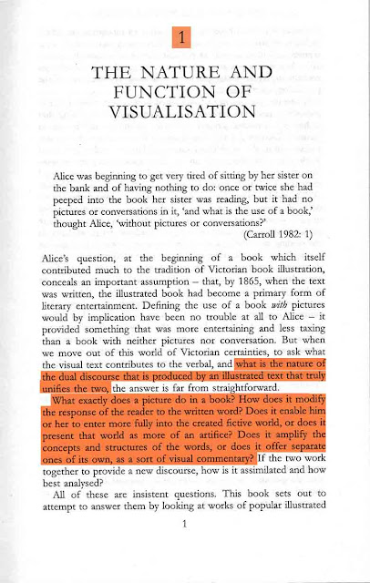
Key Text: Visualisation in Popular Fiction 1860-1960
                 Stuart Sillars
                 1995


"What is the nature of the dual discourse that is produced by an illustrated text that truly unifies the two....How does it modify the response of the reader to the written word? Does it enable him or her to enter more fully into the creative fictive world, or does it present that world as more artifice? Does it amplify the concepts and structures of the words, or does it offer separate ones of its own, as a sort of visual commentary?"

This statement would be my ideal opening paragraph too! It highlights everything I wish to study on this subject. How does illustration change your perception of what you read? Does the visual interfere with the narrative 'visuals' or do they complement them? If the illustrations present a 'visual commentary' is this a bad thing?
I think what I must keep in mind is that each book, paragraph and illustration will be hugely different from the next. Therefore instead of looking at random examples I shall focus on those where the combination is successful (and of course examples where it is not) where the position, subject matter and craftsmanship are perfect, or close, and make case studies of these in the argument for the illustrated book. 


"...a novel which perhaps has more claim than any other of its age to be consider as a single discourse of word and image since both are the product of the same author."

I find this hugely interesting but I feel it has exactly the same problems as any other book illustration. Since the illustrator is also the author then those drawings may be exactly how she envisioned the characters, setting ect. whilst writing it. Of course we do not know this for sure, even with the illustrations the she may have wanted the text open to visual interpretation. I think it is impossible to present a drawing and say this is it. This is fact. Given a piece of text you will always connote and denote the signs embedded therein, even without a visual, it is engrained into our human psyche through culture, knowledge and experience. (Barthes)


What if the author is not a good enough illustrator to present their vision of the text? Are we left with the wrong impression? Is this a bad thing? Therefore should there be any illustrations at all? 

(Welcome to the never-ending circle of questions.)

"These circumstances make the nature and function of illustration in popular fiction of all kinds something which the serious critic may no longer ignore."

This statement may not be very important for my dissertation but I am genuinely surprised how accurate it is. The subject of the lack and decline of book illustration in adult fiction is something that appears to have been hugely over looked in the academic community. Even research in the area of the dual discourse of the visual and the written is hard to come by. It furthers my opinion that book illustration has fallen so far out of fashion and the social conciousness that it is no longer an issue to many people and furthers my want to know why. 

It makes me think that while my little blog wont change these facts perhaps my illustration work can!

The game is afoot!

In this research blog for my dissertation I am aiming to address the lack of illustrations within contemporary adult fiction, the reasons for this and to decide for myself as an illustrator and avid reader of both fiction and non-fiction if this is something that should, by rights, be more prevalent in current literature.

The decline of book illustration (overlooking children's literature) appears to have been ignored and taken as a passing of the ages, of old world traditions and almost historic ways. I'd like to look both into why this is in the publishing industry, why as a culture we no longer question its lack and present a case for the renewal of the illustrated book in the contemporary best sellers lists of 'real grown up' literature.

The suggested reasons are varied and controversial. Lack of decent illustrators, a taboo on 'books with pictures in' and the rise of the digital age (Kindle, iPad & audiobooks).

Most importantly I intend to look at how the illustrations in a book modify your perceptions and responses to the text and specifically, the story. What are the pros and cons towards having illustrations sat amongst your text? Does it distract or enhance?

Personally I'm hoping my research weighs heavily in favour of of the illustrated book but I am not adverse to accepting the difficulties and dangers of illustrating prose or even perhaps the realisation that illustration has little to no place in the modern fiction book.
Who knows! 


The game is afoot!