Showing posts with label fiction. Show all posts

Thursday, 29 November 2012

Radio 4 Open Book

http://www.bbc.co.uk/i/80070/

In this episode of BBC radio 4's Open Book, a new illustrated version of A Life of Pi is discussed.

 Tomislav Torjana

In the radio episode the host asks, iis an illustrated re-publication of the award winning novel "an outrageous dumbing down? New trend? The a vision of what's to come? Or just a ploy by savvy publishers to produce gift books for the Christmas market?
Are words no longer enough?"

Presented bellow are illustrator and author reactions to the illustrated adult book.

Chris Riddell, illustrator:
"Anything that adds to the feel of the book as an object, is an all together good thing and is one way in which one can add value to a book tremendously is by the incorporation of the visual."

He suggests a reason to the lack of in book illustration: "The danger almost is to discount the obvious, that sometimes the most obvious thing is the way to go. That's the danger I think with illustration not being more accepted in books, there's a sense that one has to introduce novelty or take an unusual angle. I think sometimes books should just be illustrated directly."

Good illustration should be interpretive, but they also shouldn't overwhelm a text.
In the event of books being more widely illustrated, I think we will think of books as objects of beauty rather than the disposable things that can be throw away after use."

Kate Mosses, Author:

"These images, these chapter punctuations as I tend to think of them are incredibly enriching  for both the reader and also as the writer to put in."
On her novel, Labyrinth  "The illustrations inform the novel and are the landscape to the novel. The imaginary characters move across a real place very specifically in labyrinth. What we were trying to do...was give almost a tapestry, to give a real richness to the experience that people had already imagined in their heads."


Yann Martel, author of Life of Pi
"Illustrations don't compete they compliment the text. Richer way for getting into the text."
"What an illustrated edition brings to a reader is that the illustrations compliment the text, they don't compete. So you read ten pages of text and in doing that you form certain images and these illustrations either confirm what you've read or on the contrary suggest something else. It is a richer way of getting into the text."

 Tomislav Torjanac's expreiance on illustrating The Life Of Pi.
" Doing things from Pi's perspective seemed like a natural thing for me to do. Every illustration is from the point of view of Pi, So you never see Pi, you see what Pi is doing, the reader become Pi. You never see him you see what he's seeing."

Sunday, 25 November 2012

What's in a map?

For all Robert Louis Stevenson's opinions on other artists illustrating his works it is fascinating to note that he wrote Treasure Island as a direct response to a map he painted of the island in question. In this case the image is a prerequisite of the text.

When does a map become an illustration? Its role within the text is hugely important, if not just as important as a classic illustration. The map lets us visualise not only the scene's themselves (up to a point) but the general location of the action:

"The map that readers find inserted in Treasure Island does not function like traditional examples of cartography outside the text nor like the map vied over by characters in the text. Stevenson’s map signifies or “illustrates” actions and places within the narrative; readers use it not to locate something nor find their way outside the text but to visualize described events, as is the case with most illustrations.
Stevenson’s map also exceeds the typical illustration; not limited to a single scene, it functions as a pictorial table of contents, helping readers navigate multiple chapters to see what will happen next and where."
That the map is placed at the start of the book is an incentive to would be reader to engage in the text. It offers the "... the strange incidents, the clearness and mystery, the story told and still remaining unknown" referred to by Stevenson earlier. While this sort of 'illustration' does not give away the plot before the novel has been read as is the danger with 'representational' illustrations, it presents the reader with a point of reference and invokes intrigue as to what will  happen 'on the island' and where.


"Its embodiment of the narrative elevates the map beyond cartography to, specifically, illustration because the map's embedded story reveals a close relationship between this image and the corresponding narrative."

As a catalyst to the composition, the map functions as a radical example of 'proleptic' illustration (Mary Elizabeth Leighton & Lisa Surridge) which 'anticipates the events of the verbal plot to follow.'

The map, since drawn by Stevenson himself also allows him to "Defend his reputation as the author of authentic fiction."
"Stevenson juxtaposes textual pastiche with graphic innovation; in contrast to the text, the map appears original and impossible to duplicate, giving Stevenson a basis for differentiating himself as the author-illustrator of a unique imagetext."

While in contemporary times I would not see this a much of an issue we must remember that Stevenson was concerned that his work would be viewed as common popular fiction. That he also came up with the catalyst for the narrative: the map, would appear to make his work weigh more in favour of a work of 'high art' and of note rather than mere popular fiction.

All the World's a Stage...


Many contemporary fantasy novels that are not illustrated throughout the main body of the book include maps alongside their contents pages or in their appendices. Of those that I have found the huge majority appear to be fantasy fiction and I wonder if just the mere presence of a map would put someone off from reading the book if they were not a generally a fan of fantasy. (The same can be said for illustration in general)


Examining the map from The Hobbit, illustrated by the author J. R. R. Tolkien.

The Hobbit, while written by its author as a children's book, is widely accepted as a novel for all ages. It is not particualary modern (1937) but is still hugely relevant and extremely popular and successful, this almost de-ages it. (Helped by the new movie adaptation.)

This map like the one in Treasure Island is unique because it is a replica of that which is described in the narrative. It is not merely a map of the land in the narrative giving us a 'proleptic' look ahead in the story (like those in LotR) but it plays a part as an actual prop that the characters are in possession of. This is important in its inclusion of the reader in the story, it is almost as if they have joined the quest. We see what the characters see. 
Here the maps role in the narrative is paramount.


" On the table in the light of a big lamp with a red shade he spread a
piece of parchment rather like a map.
"This was made by Thror, your grandfather, Thorin," he said in answer
to the dwarves' excited questions. "It is a plan of the Mountain."
"I don't see that this will help us much," said Thorin disappointedly
after a glance. "I remember the Mountain well enough and the lands
about it. And I know where Mirkwood is, and the Withered Heath where
the great dragons bred."
"There is a dragon marked in red on the Mountain," said Balin, "but
it will be easy enough to find him without that, if ever we arrive there."
"There is one point that you haven't noticed," said the wizard, "and
that is the secret entrance. You see that rune on the West side, and the
hand pointing to it from the other runes? That marks a hidden passage to
the Lower Halls." (Look at the map at the beginning of this book, and you
will see there the runes in red.)
"It may have been secret once," said Thorin, "but how do we know
that it is secret any longer? Old Smaug had lived there long enough now
to find out anything there is to know about those caves."
"He may-but he can't have used it for years and years."
"Why?"
"Because it is too small. 'Five feet high the door and three may walk
abreast' say the runes, but Smaug could not creep into a hole that size,
not even when he was a young dragon, certainly not after devouring so
many of the dwarves and men of Dale."
                                                             - The Hobbit, 1995 edition.

Here the parts of the map are described and explained, you get a real sense of involvement as you examine the map whilst Gandalf points to areas of it.What I find fascinating is Tolkien's addition of, "(Look at the map at the beginning of this book, and you will see there the runes in red.)". This is almost not surprising in the context of the book, it often reads like the bedtime story it was intended as if read out load by a parent. That direct reader/story teller relationship once again heightens our sense of involvement and it directs and demands our attention of the map.

The map can be seen in both the Hobbit and Fellowship of the Ring movies:


"This book, with the help of maps, does not need any illustrations it is good and should appeal to all children between the ages of 5 and 9." -Rayner Unwin aged 10. (Son of Stanley Unwin, publisher of The Hobbit, 1936.)


As well as designing the maps for his middle earth mythology, Tolkien is the sole illustrator throughout the novel, cover to cover. I'd like to look into this in more detail later, at how this influences the reader's perception of the text and at the skills of the author fully realising his own text through illustrations.
On being asked if the american edition of the hobbit might be published using 'some good American artist', Tolkien responds: " I am divided between knowledge of my own inability and fear of what american artists (doubtless of admirable skill) might produce." Tolkien's illustrations are praised by critic Margery Fisher for being; '...not self-consciously naive, they put into visual form the kind of magic world in which a child might well have imagined.' The illustrations undoubtedly work and have a style which, mainly through the maps and book covers, have become inseparable from Middle Earth.
One one thing Tolkien was adamant on; "In any case I agree that all the illustrations ought to be done by the same hand: four professional pictures would make my own amateurish productions look rather silly." -The art of the Hobbit by Wayne G. Hammond & Christina Scull, 2011, Introduction.

This brings up another issue to take note of: What happens when a series of books, continuing a single story or linked stories are illustrated by different people, with different styles and therefore outcomes. Does your response to the narrative change?


Examining the fiction works of Kirstin Cashore.

A case of (map) illustrator reassignment occurs in the Graceling trilogy, (admittedly a series aimed at the mature young adult) and although I hadn't noticed it entirely because I read the books so far apart because of publishing dates, if I were to read them in succession as intended I feel the sudden artistic change would definitely alter the way in which I read them.

The first book in the series, Gracling, is accompanied by this carefully penned map, illustrated to look like a map that might be found within the narrative.


The map, placed in the front end sheets demands our attention as soon as we open the book. We can already see that presidency is given to 'Monsea' and can thus deduce that an important part of the narrative will be played out there. That the map is not of an island but of a peninsular of land is also of note and sets us up for the mystery of what lies beyond the mountains. 
We are also presented with the crests of each 'kingdom' on the map which is something that doesn't happen in any of the later books.  While little can be decoded from the crests on first glance there are obvious signs including swords representing kingdoms more akin to war and attacking and those of turrets and walls representing neutrality and defence. 
The narrative revolves around the politics and relationships between each kingdom with the map clarifying and explaining the alliances and wars.
The style of illustration, decorative and delicate resonate with the fantasy stereotype and quickly identify the texts genre. 

The second books leading map illustrated by  Jeffery C. Mathison:

This map for the second novel in the trilogy is distinctly different from the first. Gone are the decorative boarders and titles that make it look like a map straight out of the fantastical libraries described in the narrative and the crests belonging to each land. Instead the map is more matter of fact. While it could still be an extract from the narrative, with its spiky fonts and key it feels much more like it is there just for the reader to make clearer the written narrative. 
What this map does do is reveal a key narrative twist; the land from the first book in the series and that in this book are connected, divided only by an impassible mountain range. This is quite an important point in the narrative and for the entire trilogy so it surprises me that the map, placed before the novel even begins, reveals this. The characters in both stories are oblivious to this fact and while this gives the reader an omniscient stance and creates dramatic irony I can't help feeling like this gives the game away too soon. Obviously this heavily influences our reading experience, for better or worse is personal opinion although it does keep the expectation and suspense of 'discovery' high and the pace of the book going.

The third book published a full three years after the first two is wholly different in its illustration approach. It is this book that has the most experience changing illustration style in my opinion.
Illustrated by Ian Schoenherr.


While the change of illustrator between the fist two books are barely noticeable unless the reader is specifically looking, the change in the third and final book is striking and highly apparent.
Not only does the map style change from delicate ink lines to brash, strong woodcut style inks but there are additional maps of interiors and palaces included as well as ornamental chapter openers and chapter headers, all of which dramatically change the way the narrative is read.
While I personally think the illustrations are beautiful and the authors willingness to be illustrated fantastic, I also want to cast a critical eye on the pairing. 

The feel of the book, when compared to its two predecessors is completely different, and while this has a huge amount to do with the story and main character from who's viewpoint the book is told (and that my copy is a hefty 550 page hardback compared to my other paperbacks)I feel the illustrations have a large part to play also.
The book feels much younger in tone and which is odd for its violent and sensitive content, this I feel is invoked and reflected by the style of illustration used.
I'm not saying it is inappropriate because it sits wonderfully with the text in the guise of a relic found in the libraries the main character often inhabits, only that it can often work against the text as an example of mature young adult fiction. At times it is almost mimics fairy tale illustration.
 There could however be something in this, a juxtaposition of dark and moody images in a nostalgically youthful style set against the horrors and wonders of the world the text creates. Also the role of story telling within the narrative is important and so may be reflected in the images.

It's difficult to dissect this book since I love and admire the illustrations so much, I just feel that they 'youthen' its feel and perhaps therefore its (age) appeal. This is exactly the conclusion I didn't want to draw as I'm arguing the case of the illustrated adult novel. But however much I love the dual discourse I cannot ignore the fact the illustrations in this book make me aware, in a niggling way, of its young readership appeal and that it is in a different spectrum to the first two of the trilogy. (Which since it is a good book should deter me yet it's just there like an annoying itch.)


What I do love about the extra maps in this book, asides from their engrossing detail and ability to guide your envisionment of the 'location', is the addition of a final map of the 'Known World'. This comes at the very end of the book and is not easily noticed until studied after the novel has concluded, which is paramount because it illustrates a huge point in the narrative when all the characters from the three books come together and realise the existence of each others lands. Were this to come at the beginning or even 'amongst' the book the the plot would have been ruined and the way in which the narrative read dramatically altered.


Cashore documents her working relationship with Schoenherr and want for illustrations on her blog here.


Examining the maps of the 'A Song of Ice and Fire' series.

These maps from the second book 'A Clash of kings' in George R.R. Martin's Song of Ice and Fire series illustrate the land of Westeros in which the majority of the story takes place.


Once again each map is decorative in a style such that it could be a relic of the world it depicts therefore drawing us into the narrative and handing us a physical piece of the fiction.
 It is less pictorial than those already examined and has a more clinical approach, perhaps distancing the reader slightly, it does however present a clear visualisation of the locations.
What is important about this map is that it give us a sense of the scale and distance we are witnessing and experiencing in the narrative. In reading the text we discover that it takes numerous months to travel from 'Winterfell' in the north to 'Kings Landing' in the south, neither of which are either very southern or northern when in contrast to what the map shows.
As well as helping us understand the current narrative the map also allows us to understand the history presented in the text and the political 'map' and cultural differences of the characters.
Once again locations of key interest and import are revealed in the choice of maps, foreshadowing future events and invoking suspense as to when and what making it a proleptic illustration.


Maps by James Sinclair.


In conclusion:
On the pure role of the map to influence our reaction to the text it is clear to me that they are not merely images of locations or the lie of the land but important, crucial and noteworthy 'illustrations'. They act as 'in book' illustrations do, guiding and assisting the narrative, evoking suspense and drama and foreshadowing plot to come.


Do Pictures Pirate Text?

What I liked most about the interviews with Roald Dahl and W.D. Snodgrass was their apparent willingness and enthusiasm to have their work illustrated and engage in the writer/artist relationship. (Which is always nice!)
This paper looking at the role of illustration in the original publications of Robert Louis Stevenson's Treasure Island show another side to this willingness. It is quite opposite to our times (as a general rule) but Stevenson wanted his work illustrated because it would 'sell better'. 
There are contemporary examples of books being sold on the credit of their illustrations, the folio society being the main one, however a book aimed at the best-sellers list would generally be wary of a surplus of illustrations due to current conventions where illustration is seen as somewhat childish or archaic.
The people of Stevenson's day meanwhile would be more than happy and attracted to a book rich in the visuals presented here.


"As another medium for circulating the narrative, illustrations also deserve our attention because of their proliferation and Stevenson's preoccupation with them. In his account of writing Treasure Island, Stevenson envisions his map of the island as the first illustration and as resistant to reproduction.
He worries that artists can devalue his text through inaccurate imitation or revision. Both sources reveal that Stevenson values illustration for improving the novel's sales but also is concerned they contribute negatively to it's status as popular fiction."

Stevenson was still obviously concerned with how the dual discourse of text and image would read in regards to his story but also how it would be received publicly. It's interesting that he doesn't want (bad) illustration to devalue his work to a piece of common popular fiction when in contemporary times the same might be said for illustration in adult fiction to lower the expectation of the texts intelligence or age of its readership.

The dangers and difficulties with a writers work being illustrated are discussed here. From the authors point of view his work should to be key in visualising. The illustrations must compliment but not steer the readers reception and response to the text.


As examined earlier (looking at comics) the primary danger when the book is picked up is not only that the illustrations put off a reader but that the book in Stevenson's words, "be skimmed, swift as a racer, the points seized, the story drained of such cheap virtue as it possesses in five minutes instead of in the tedium of several hours of study."
While this can work well in attracting the audience, invoking interest in the mystery ahead, the illustrations should not tell the whole narrative but give a taste:
"There is nothing more delightful than the first skimming of a storybook with pictures: the faces, the costumes, the strange incidents, the clearness and mystery, the story told and still remaining unknown."

'Expert illustrators must remain loyal to the text, while simultaneously adding their own style: "A picture in a story book must be something more than a mere pretty picture...it should narrate. It should be the handmaiden of the text, competing with another accent and the stamp of a different mind."


Stevenson acknowledges a want and need for illustration but is also wary of it 'pirating' the text. "Illustrations contribute to the text's popularity but pressure the author to create the more memorable versions of the characters and events. Of greater concern to Stevenson are poor quality illustrations that fail to convey the essence and depth of the written narrative."

Stevenson's pirates are unique to us in that they are not the swashbuckling pirates we generally meet in story books and blockbuster movies but are are decaying and weather beaten. And yet as the book is illustrated and re-illustrated as time goes by those characters are generalised into a stereotype we can all recognise.

"The emphasis on deterioration suggests Stevenson is self-conscious that he employs a timeworn stereotype. Ironically, however, his pirates’ ruined forms set them apart from their predecessors (and many of their successors), who typically attract readers with their glamorous, sturdy figures. 
The illustrations frequently ignore Stevenson’s thorough character sketches by instead replicating these stereotypes and inscribing them back into the narrative. "
Once more it is down to the author to "create the more memorable versions of characters and events"


That the text is not only illustrated but re-illustrated is an interesting fact in itself. 
The illustrations tend less to draw upon the narrative and Stevenson's descriptions and more upon copying each other and reflecting the fashions of the day.


"The value of otherwise acclaimed work fades, as different artists’ versions of the same crucial scenes, when viewed collectively, appear to lack innovation."
On the illustration below: "The woodcut employs a common approach to representing criminals: whether they feature pirates or highwaymen, among others, such illustrations send a clear message that their subjects are based on a generic figuration of “the outlaw.”


Wednesday, 21 November 2012

Dahl & Blake

Roald Dahl & Quentin Blake

Its is not often that you hear Roald Dahls name used without the mention of his close friend and illustrator Quentin Blake, such is the iconicness of their relationship and of their visual 'brand'.

What is interesting in this pairing is the complete trust and intuitiveness with which both artist and writer viewed each others work.
"While working on the BFG in 1982, Dahl even altered his own written description of the friendly giant so it fitted with some of the drawings Blake had already made. In the storyteller: The Life of Roald Dahl, Donald Sturrock says that Blake was able to almost intuit what Dahl's characters would look like. "Quentin began to realise just how precisely Roald imagined his stories," he writes, "Initially, Dahl had described his character wearing a black hat, apron and large black boots. But when Roald saw Quentin's drawing, he knew at once that the giant needed to look softer and more loveable."


That Dahl changed his narrative after seeing Blake's illustrations in key in discussing how a relationship like this works and that unlike many re-illustrated volumes, illustration had an equal position to the writing:  "Dahl was adamant that his text be full of illustrations, "What was so nice about Roald was that he actually wanted the pictures," Blake recalls on his website. "He didn't like it if there weren't enough."
While this is unfortunately very unique of authors (and more frequent in children's literature) it shows that the narrative and illustrations were intended to be read together, in a single discourse.

Blake on illustrating:
"Blake's job was to convey their many unappealing traits in pictures. (the Twits)
Early on in the story, Dahl describes Mr Twit's beard as being lodged with bits of decaying food. Conveying this in a single portrait image was difficult  so Blake drew a 'magnifying glass' as an in-set illustration, which zoomed in on the hairs and the morsels of sardines, cornflakes and gorgonzola contained within.  It was he says, a question of "how do you enlarge the text slightly, without contradicting it?" Blake added further visual elements too which, while not taken directly from Dahl's text, were pitched as if they were."
An example of extending the narrative, mainly through disgust. Blake could have chosen to draw a portrait of the man purely as a representation of what is written, instead he gives us this close up which acts to heighten our dislike of a foul man through its stomach turning imagery. (Which kids love!)


Quentin Blake on Illustrating The Twits.

Like the collaborations between Thompson and Steadman a brand has been created with the style, typography and interactions between text and image. Both artists are synonymous with each others work.


Blake on his process and collaboration

Tuesday, 20 November 2012

Make Real Through Fictional Presentation

Looking at an example of an illustration which accompanied a Victorian newspaper article about homelessness it is interesting to note that at the time photography was a used and functional medium and yet an illustrated presentation was preferred to sit alongside the text.
 "Yet this should not surprise us in an age when many find the dramatisation of recent events in  fictionalised on television or film accounts -of the holocaust say, or of the hostage crisis in the Middle East- more acceptably 'real' than factual and scholarly accounts." - Stuart Sillers, Visualisation in popular fiction.
In these cases what is happening is the use of a single dialogue of the text and illustration to 'make real through fictional presentation' a truth of contemporary reality that is otherwise difficult to grasp in human terms.


In the text accompanying this illustration, the author uses characters to describe the facts and situations of those people living on the streets. However it would seem that these characters are invented, the author is giving life and story to those he sees that the illustrator has presented. 'The fact that the characters are invented and given fictional life stories makes the scene more real to the reader.' We can sympathise with them, if not identify. That we now know of them 'personally' and not as just someone in the street we know nothing of, makes us care more about them, even though these particular people are not strictly speaking, real.

"We are taken along to the asylum with the central character, and approach it through her eyes as much as through those of the omniscient narrator. There is effectively a dual viewpoint, allowing us to both experience the asylum as does the central character, and also to recoil from it in horror."


Dickens


The most striking point in this quote in which Dickens discusses the actuality of life in the London slums from the preface of Oliver Twist is that "Dickens assumes without question that the 'reality' of urban vice and squalor is that which is presented by Hogarth - a statement of 'truth' of the image which reveals much about the impact of the earlier artist's work upon the writer and also of the larger power of the transmitted vision of the truth rather than the external truth itself at a time when engravings were the major source of reproduced visual data."

People are more willing to take presented visuals as truth when accompanied by the text than they are the reality which they may not be aware of or just unwilling to accept.
 The difference is that there is an involvement occurring between the reader and a text or image, they are being presented something which they can then use to recognise the world with and because they have read the text/image have (secondary) experience with and so take that as truth. Its almost like having a preconceived opinion about someone before meeting and getting to know them.

Monday, 19 November 2012

Homles & The Hat.

Every once in a while an illustration can be presented alongside the text and become iconic even though it is a narrative departure.
 The public view of the character Sherlock Holmes is inseparable not only with his friend, Watson, but also with his hat. The deerstalker. And yet Sir Arthur Conan Doyle never once described Holmes as wearing one throughout his series of novels. 
This depiction comes from the illustrations by Sidney Paget, originally published with the narrative in the Strand Magazine 1880's onwards. (It is of interest to note that as this is a 'countryside garment' the illustrator only showed Holmes wearing it in appropriate rural or travelling scenes and never in urban London.)

It is fascinating to see how such a narrative departure has produced one of the most iconic images of a character in fiction and perhaps without even having an illustration present in the text, changed the way in which we read it. The hat has been absorbed into our shared idiolect.


Sidney Paget


To quote the current BBC adaptaion: "It's not a deerstalker anymore, it's a Sherlock Holmes hat... you're this far from famous"

Sunday, 18 November 2012

Extending the Narrative.

In the image of Little Nell's death the narrative is extended through metaphors by (in a paradox) altering the narrative of the text. The illustration is contributing to the continuum of the narrative and so alters our reading experience.

The placement of the illustration within the text can also extend the narrative and change our experience of the reading the book. 

On little Nell:

"Coming at the end of the chapter, it provides us with a moment of stati, of contemplation, in the face of the death f the character. That the engraving is placed sideways in the original edition, with the consent and to the satisfaction of Dickens, is also significant. We have to turn the book around to take in the image, and in doing so we suspend the continuum of the verbal discourse. The presentation of this moment of stasis within the text is only one function of the image, which also extends and deepens the verbal text in ways explored above." -Stuart Sillars


The placement of an illustration therefore is almost as important as that which it depicts. You may want pauses in your text for contemplation, to build tension ect. but you do not want to give away too much at the wrong moment. If the illustration of Little Nell were to come before the end of the chapter interrupting the text, then you'd be forced to stop reading unnaturally and wouldn't necessarily have the moment of reflect or perhaps even the understanding of what is presented. Furthermore if an illustration with such obvious connotations is shown before the event in the text this would alter our reading experience for the worst, ruining the 'ending.' Spoilers if you will.

The placement of illustrations can have a number of functions including heightening the suspense of a scene by delaying a moment in the narrative. Advancing the narrative by restraining it. An illustration may extend the text in its foreshadowing of events, depicting a happy scene like a weeding with signifiers of a funeral ect. evokes a sense of dread or unease. The illustration almost allows for a kind of dramatic irony, in which the reader knows more than the character.


Thursday, 15 November 2012

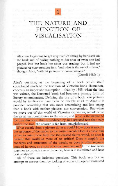
Key Text: Visualisation in Popular Fiction 1860-1960
                 Stuart Sillars
                 1995


"What is the nature of the dual discourse that is produced by an illustrated text that truly unifies the two....How does it modify the response of the reader to the written word? Does it enable him or her to enter more fully into the creative fictive world, or does it present that world as more artifice? Does it amplify the concepts and structures of the words, or does it offer separate ones of its own, as a sort of visual commentary?"

This statement would be my ideal opening paragraph too! It highlights everything I wish to study on this subject. How does illustration change your perception of what you read? Does the visual interfere with the narrative 'visuals' or do they complement them? If the illustrations present a 'visual commentary' is this a bad thing?
I think what I must keep in mind is that each book, paragraph and illustration will be hugely different from the next. Therefore instead of looking at random examples I shall focus on those where the combination is successful (and of course examples where it is not) where the position, subject matter and craftsmanship are perfect, or close, and make case studies of these in the argument for the illustrated book. 


"...a novel which perhaps has more claim than any other of its age to be consider as a single discourse of word and image since both are the product of the same author."

I find this hugely interesting but I feel it has exactly the same problems as any other book illustration. Since the illustrator is also the author then those drawings may be exactly how she envisioned the characters, setting ect. whilst writing it. Of course we do not know this for sure, even with the illustrations the she may have wanted the text open to visual interpretation. I think it is impossible to present a drawing and say this is it. This is fact. Given a piece of text you will always connote and denote the signs embedded therein, even without a visual, it is engrained into our human psyche through culture, knowledge and experience. (Barthes)


What if the author is not a good enough illustrator to present their vision of the text? Are we left with the wrong impression? Is this a bad thing? Therefore should there be any illustrations at all? 

(Welcome to the never-ending circle of questions.)

"These circumstances make the nature and function of illustration in popular fiction of all kinds something which the serious critic may no longer ignore."

This statement may not be very important for my dissertation but I am genuinely surprised how accurate it is. The subject of the lack and decline of book illustration in adult fiction is something that appears to have been hugely over looked in the academic community. Even research in the area of the dual discourse of the visual and the written is hard to come by. It furthers my opinion that book illustration has fallen so far out of fashion and the social conciousness that it is no longer an issue to many people and furthers my want to know why. 

It makes me think that while my little blog wont change these facts perhaps my illustration work can!