Note to self: Pottermore!!
Why didn't I think of this already!!!
http://www.pottermore.com/
Thursday, 29 November 2012
Internal Visualisation.
Its is suggested that Books offer a cathartic escape,
The romantic continuum, visualization in popular fiction. Stewart Sillars
To be cont.
The romantic continuum, visualization in popular fiction. Stewart Sillars
To be cont.
A New Era for Illustration
'In the digital future, texts will be annotated visually, animated and illustrated like never before' -Riddell
http://www.guardian.co.uk/books/booksblog/2012/aug/12/chris-riddell-new-era-illustration
Article written by illustrator Chris Riddell , from the Guardian Newspaper online discussing the future of book illustration in the digital era. (Aug 2012)
" As the digital revolution gathers momentum, traditional print publishing is being forced to change. In this new age of austerity, as chill winds blow through publishers' offices, we need illustrators of the calibre of EH Shepard more than ever. And they're out there - look at Posy Simmonds' wickedly perceptive novel Tamara Drewe, David Roberts' brilliantly quirky illustrations to Mick Jackson's Bears of England and Shaun Tan's surreal and exquisite wordless story The Arrival. Like Shepard, these illustrators' work reaches all ages.

"The smart money was always on illustration rising up and breaking free from the shackles of entirely commercially driven projects. A more entrepreneurial spirit has come about, in part due to the fact that digital hardware and software has come down so dramatically in price, coupled with fast broadband/ wi-ficombos becoming standard issue. This has so readily enabled the creation and production, distribution and promotion of images that contemporary illustration has emerged from the shadows to kick-start new self-initiated projects, publications and associated publicity. Equally responsible for the rise in fortune, but far less recognised perhaps, has been the input and impact of a new breed of art and design school educators, who are pushing graduates into a competitive marketplace fuelled with the vision to succeed self-sufficiently."

http://www.guardian.co.uk/books/booksblog/2012/aug/12/chris-riddell-new-era-illustration
Article written by illustrator Chris Riddell , from the Guardian Newspaper online discussing the future of book illustration in the digital era. (Aug 2012)
" As the digital revolution gathers momentum, traditional print publishing is being forced to change. In this new age of austerity, as chill winds blow through publishers' offices, we need illustrators of the calibre of EH Shepard more than ever. And they're out there - look at Posy Simmonds' wickedly perceptive novel Tamara Drewe, David Roberts' brilliantly quirky illustrations to Mick Jackson's Bears of England and Shaun Tan's surreal and exquisite wordless story The Arrival. Like Shepard, these illustrators' work reaches all ages.
As the Kindle's dread grip on digital publishing is challenged by tablet computers and android smartphones, with their bright screens and high resolution, the need for illustration is growing. Newspapers such as the Guardian and the Observer, meanwhile, are expanding into the internet's broad open spaces - spaces with plenty of room for illustration.
At the same time graphic novels, computer games and CGI animation are blurring the old distinctions and categories in publishing. In the digital future, texts will be annotated visually, animated and illustrated like never before. The austere 'prayer book' paper that permitted the space for Shepard's illustrations to Pepys' diaries is now being recreated in the digital era.
It is a space waiting to be filled by today's illustrators. " Chris Riddell.

Similarly this article by Lawrence Zeegen furthers Riddell's optimistic outlook on the illustration industry. (Computer Arts, Issue 174. May 2010.)

Radio 4 Open Book
http://www.bbc.co.uk/i/80070/
In this episode of BBC radio 4's Open Book, a new illustrated version of A Life of Pi is discussed.

In the radio episode the host asks, iis an illustrated re-publication of the award winning novel "an outrageous dumbing down? New trend? The a vision of what's to come? Or just a ploy by savvy publishers to produce gift books for the Christmas market?
Are words no longer enough?"
Presented bellow are illustrator and author reactions to the illustrated adult book.
Chris Riddell, illustrator:
"Anything that adds to the feel of the book as an object, is an all together good thing and is one way in which one can add value to a book tremendously is by the incorporation of the visual."
He suggests a reason to the lack of in book illustration: "The danger almost is to discount the obvious, that sometimes the most obvious thing is the way to go. That's the danger I think with illustration not being more accepted in books, there's a sense that one has to introduce novelty or take an unusual angle. I think sometimes books should just be illustrated directly."
Good illustration should be interpretive, but they also shouldn't overwhelm a text.
In the event of books being more widely illustrated, I think we will think of books as objects of beauty rather than the disposable things that can be throw away after use."
Kate Mosses, Author:
"These images, these chapter punctuations as I tend to think of them are incredibly enriching for both the reader and also as the writer to put in."
On her novel, Labyrinth "The illustrations inform the novel and are the landscape to the novel. The imaginary characters move across a real place very specifically in labyrinth. What we were trying to do...was give almost a tapestry, to give a real richness to the experience that people had already imagined in their heads."
Yann Martel, author of Life of Pi
"Illustrations don't compete they compliment the text. Richer way for getting into the text."
"What an illustrated edition brings to a reader is that the illustrations compliment the text, they don't compete. So you read ten pages of text and in doing that you form certain images and these illustrations either confirm what you've read or on the contrary suggest something else. It is a richer way of getting into the text."
Tomislav Torjanac's expreiance on illustrating The Life Of Pi.
" Doing things from Pi's perspective seemed like a natural thing for me to do. Every illustration is from the point of view of Pi, So you never see Pi, you see what Pi is doing, the reader become Pi. You never see him you see what he's seeing."
In this episode of BBC radio 4's Open Book, a new illustrated version of A Life of Pi is discussed.

Tomislav Torjana
In the radio episode the host asks, iis an illustrated re-publication of the award winning novel "an outrageous dumbing down? New trend? The a vision of what's to come? Or just a ploy by savvy publishers to produce gift books for the Christmas market?
Are words no longer enough?"
Presented bellow are illustrator and author reactions to the illustrated adult book.
Chris Riddell, illustrator:
"Anything that adds to the feel of the book as an object, is an all together good thing and is one way in which one can add value to a book tremendously is by the incorporation of the visual."
He suggests a reason to the lack of in book illustration: "The danger almost is to discount the obvious, that sometimes the most obvious thing is the way to go. That's the danger I think with illustration not being more accepted in books, there's a sense that one has to introduce novelty or take an unusual angle. I think sometimes books should just be illustrated directly."
Good illustration should be interpretive, but they also shouldn't overwhelm a text.
In the event of books being more widely illustrated, I think we will think of books as objects of beauty rather than the disposable things that can be throw away after use."
Kate Mosses, Author:
"These images, these chapter punctuations as I tend to think of them are incredibly enriching for both the reader and also as the writer to put in."
On her novel, Labyrinth "The illustrations inform the novel and are the landscape to the novel. The imaginary characters move across a real place very specifically in labyrinth. What we were trying to do...was give almost a tapestry, to give a real richness to the experience that people had already imagined in their heads."
Yann Martel, author of Life of Pi
"Illustrations don't compete they compliment the text. Richer way for getting into the text."
"What an illustrated edition brings to a reader is that the illustrations compliment the text, they don't compete. So you read ten pages of text and in doing that you form certain images and these illustrations either confirm what you've read or on the contrary suggest something else. It is a richer way of getting into the text."
Tomislav Torjanac's expreiance on illustrating The Life Of Pi.
" Doing things from Pi's perspective seemed like a natural thing for me to do. Every illustration is from the point of view of Pi, So you never see Pi, you see what Pi is doing, the reader become Pi. You never see him you see what he's seeing."
Tuesday, 27 November 2012
Where have all the book illustrators gone? The Independent.
Where have all the book illustrators gone? An article from the newspaper The Independent.
This article discusses the reasons for the lack of illustrated adult novels in the last half a century It includes controversial opinions like a lack of decent illustrators and introduces the rise of the inner monologue.
'Up until the Fifties and Sixties it wouldn't be unusual for a mainstream publisher to illustrate adult books. '
'Dan Franklin at Jonathan Cape is one of the few British publishers who bucks the trend. "I think a) it's fashion", he says trenchantly. "And b) there aren't that many great illustrators. It's rare you can come across someone who can draw. Even when you're looking for someone to do book jackets, it's hard to find someone who can draw the human figure – it seems to be unfashionable now."
I fully agree with the fashionability of illustration in books being key to its disappearance but the opinion that 'there aren't that many great illustrators' is, I think, another example of fashion. Why do illustrators have to draw the characters to represent what is occurring in the text?
Simon Prosser, publishing director at Hamish Hamilton: It might be", he says, "that illustration is simply unfashionable. I have a strong, deep attachment to books that were illustrated... I remember from my early reading, the classics of natural history, like Izaak Walton and The Natural History of Selborne and they were all illustrated." Which brings us to another issue, the dearth of publishers with some sort of visual grounding.
Does it matter if adult books are all text? Even the greatest enthusiasts wouldn't say you should illustrate everything. You wouldn't wish on any artist the job of drawing much of Virginia Woolf. But the possibility that illustrations could actually illumine writing and draw out elements of a narrative doesn't seem to count for much any more. And as Posy Simmonds, well-known as a graphic novelist as well as illustrator, observes, illustration can do many things for a novel: "There's lots of choice, whether to interpret, decorate, contradict. It can add to or detract from the writing."
On the change in modern literature:
But there is a problem with the nature of modern fiction. As the novelist Piers Paul Read says, "illustrations are best suited to a novel with a strong narrative, that is to say, illustrating an incident – and there are fewer such novels around.
He (Quentin Blake) thinks that the nature of modern fiction is a challenge, but not an insuperable one. "Once novelists got into the interior monologue... that's what spoiled it for illustration", he says. "But there are things you could do that we've lost the habit of doing. There's a wrong assumption that you're going to draw exactly what the text says. But it calls for a bit of thinking. You don't always want to see what the protagonist looks like. Are you drawing surroundings, atmosphere, furniture? There are ways of contributing to novels. Commissioning drawing, I think, is a habit as much as anything. One doesn't want to say everything should be illustrated. But there are moments when something very interesting could be done. We've lost the habit of thinking like that."
The perception of illustration in books as something for children:
Because illustration is now the preserve of children's books, there's a sense that this is where it belongs, with childish things like comics. Or as Quentin Blake says, "there's a feeling it's not quite grown up to have pictures." Posy Simmonds agrees: "there's a sense that pictures are something you grow out of."
On The Resurgance of the illustrated book in the digital platform:
But it's not too soon to write off the possibility of illustration making a return. And curiously enough, it comes from the very development that people darkly assume to be undermining publishing as we know it: digital technology. Kindle makes the reproduction of colour plates far cheaper than now. As Simon Rossiter observes: "Books are more and more in the digital world – there's a real case for making books more special... it would be great to have a special Kindle edition of a novel." Dan Franklin is even more upbeat: "We'll find in the years to come that there's a renewal of illustration in books. Because of Kindle there's a new impulse to make the physical hardback book a more beautiful object. Illustration will be part of that. And when the enhanced e-book is up and running, it will be part of that too."
Monday, 26 November 2012
Pullman on Boarderland conflicts
Philip Pullman answered questions \about his lecture including, When the artists 'boarderland' conflicts with your own and what happens when your view of a characters is not that presented in the illustration. "It comes down to temperament, whether you connect with the illustration on a deeper level, below the level which we can talk about almost. It's a mysterious thing!"
Also addressed is the change a film adaptation has upon your personal 'boarderland' from the book.
"Reading in the Borderland" Philip Pullman
Author Philip Pullman (His Dark Materials) here presents the idea of what he names 'Boarderlands': the space between the private mind of the reader and the book they are reading.
'Boarderland is different for every individual. Whilst part of the boarderland belongs to the book...part of it is made up and contributed to by and belongs only to the particular reader, to us, to our memories, memories of other books, memories of real places and real people we know, the association's we have with this particular word or that particular style of illustration. Aspects that resonate with our own personal temperament. So while whereas many readers may be reading the same book, no two people will be reading it in exactly the same way. However we can come back from this boarderland and talk about it, tell others about our experiences about it and compare with their experiences.'
He explains that the boarderland is a kind of Liminal space; 'a state characterised by openness and ambiguity, it is period of transition where normal limits to thought, self understanding and behaviour are relaxed, a situation that can lead to new perspectives.'
Here the author looks at 'semiotics' (if we de-romanticise it) and how we all read everything differently because of our own experiences.
"Pictures work differently from words, they function like a window. We look through the window, lean on the windowsill, daydream. We send our imagination out like a bird, to fly out over the landscape that someone else has generously imagined for us, and make our own discoveries."
Pullman explains how pictures contribute to our enjoyment of the book: http://www.youtube.com/watch?v=XxS0JUhacug&feature=relmfu

Pullman Illustrates his chapter heads with a small decorative device that he describes like more of a symbol, each is simple and of a similar style except for the one for the last chapter, Bridge to Stars.
 'What is significant here is what is not there - every other chapter header is in a box with a heavy black frame.' Whereas in this illustration the frame is missing and the style completely different. The style I think is more down to the skill of Pullman in his want to convey an accurate image of Lyra's face: "She's looking out at the universe opening up above her, wondering at the extraordinary spectacle while being daunted by what she has to do and being simultaneously absolutely determined to do it."
On the final illustration in the final book Pullman couldn't decide what to draw that would represent the heart breaking content of the chapter and so, "Abandoned the idea of simple representation becuase the heart of that chapter isn't about the place it is about the feeling...of love and loss. So I was abstract about it...entirely symbolic."

'Boarderland is different for every individual. Whilst part of the boarderland belongs to the book...part of it is made up and contributed to by and belongs only to the particular reader, to us, to our memories, memories of other books, memories of real places and real people we know, the association's we have with this particular word or that particular style of illustration. Aspects that resonate with our own personal temperament. So while whereas many readers may be reading the same book, no two people will be reading it in exactly the same way. However we can come back from this boarderland and talk about it, tell others about our experiences about it and compare with their experiences.'
He explains that the boarderland is a kind of Liminal space; 'a state characterised by openness and ambiguity, it is period of transition where normal limits to thought, self understanding and behaviour are relaxed, a situation that can lead to new perspectives.'
Here the author looks at 'semiotics' (if we de-romanticise it) and how we all read everything differently because of our own experiences.
"Pictures work differently from words, they function like a window. We look through the window, lean on the windowsill, daydream. We send our imagination out like a bird, to fly out over the landscape that someone else has generously imagined for us, and make our own discoveries."
Pullman explains how pictures contribute to our enjoyment of the book: http://www.youtube.com/watch?v=XxS0JUhacug&feature=relmfu
Here Pullman assesses his own illustrations for his trilogy; His Dark Materials.
Once again we can argue whether these novels come under the umbrella of 'children's fiction' or adults. They are marketed at a young audience and follow the adventures of a young girl Lyra, who a mature audience may find it difficult to relate to. However the themes and event explored within the text are hugely mature (I'm not sure I understood half of what I was reading at the age of 13.) The book explores the links and differences between science and religion, proposing that they are one in the same, which is immensely deep and controversial without the main child characters possibly killing 'god'. The narrative is also very dark (killing god?) looking at a child being used and to some extent abused by her parents and the terrifying soul sucking consequence's of Lyra and Will's actions by the end of the series. It is safe to say that we can firmly position the books not only within children's literature but also in adults.

Pullman Illustrates his chapter heads with a small decorative device that he describes like more of a symbol, each is simple and of a similar style except for the one for the last chapter, Bridge to Stars.
 'What is significant here is what is not there - every other chapter header is in a box with a heavy black frame.' Whereas in this illustration the frame is missing and the style completely different. The style I think is more down to the skill of Pullman in his want to convey an accurate image of Lyra's face: "She's looking out at the universe opening up above her, wondering at the extraordinary spectacle while being daunted by what she has to do and being simultaneously absolutely determined to do it."
The lack of frame around her face is because, 'All the boarders, frames have been broken open- the whole universe is wide open, nothing is shutting her in.' (literally!) Here is an example of the illustration being more than just a literal visual representation of the text. It is more symbolic. It changes the way in which the reader responds to the text. A 'barrier' has been broken.
On the final illustration in the final book Pullman couldn't decide what to draw that would represent the heart breaking content of the chapter and so, "Abandoned the idea of simple representation becuase the heart of that chapter isn't about the place it is about the feeling...of love and loss. So I was abstract about it...entirely symbolic."
The illustration is not of the characters of the scene but of two roses bound together representing the characters and their departure from each other. 'Will and Lyra are bound together by love but have to face away from each other forever. It is an Emblem not a picture."

"I owe as much to the great illustrators as I do to the writers whose work they illuminated. More than anything else I remember the look of their work on the paper, the sheer pleasure my young-and old- eyes have found in the shape of a line, the delicacy of hatching, the impression of the weight or texture or movement, or mischief or sorrow, or courage, or joy conjured up by the simple magic of black lines on the white paper. How do they do it? I don't know. Geniuses, all of them. Long live the illustrators! Hoorah for their work!" - Philip Pullman.
Folio Society
While most contemporary books on the best-sellers shelf in Waterstones are no longer illustrated there are still sources that publish and sell novels that pride themselves on their inclusion of illustration and the quality of their books.
The folio society, publishing for over 50 years now, strives to create beautiful books that enhance their readers pleasure through its binding and illustrations.
Folio Society, about us:
Great books should be outstanding not only in literary content but also in their physical form: this has been the philosophy of The Folio Society since it was founded in 1947 by Charles Ede, with a dream of publishing beautiful books that would be affordable to everyone. Our pleasure in reading is enhanced by the book itself, in which typography, illustration, paper, printing and binding all play a part in creating a harmonious whole. In a world of declining publishing standards, where most books are cheaply printed, and bound using low-grade materials, The Folio Society resolutely sets store by traditional values of excellence; for our designers and production personnel the term 'quite good' means 'no good': only the best is good enough.
Part 2:
In this second part of the interview Blake talks about the 'rise of the inner monologue a subject that I want to look at it much bigger detail later on!)
Each year the Folio Society run an international competition to illustrate one of its books. I'll be entering this competition working from the text chosen, Aldous Huxley's Brave New World. I think that my own proccess will be intresting and important to examine given the amount of research I've done in the subject, and so I'll be posting my thoughts and progress on this blog. I fully expect it to be monumentaly difficult as apose to deconstructing other illustrators work,(lots of hypocrasy on my part I'm sure!) but that it will be an invaluable insight into the mind of the book illustrator.
The folio society, publishing for over 50 years now, strives to create beautiful books that enhance their readers pleasure through its binding and illustrations.
Folio Society, about us:
Great books should be outstanding not only in literary content but also in their physical form: this has been the philosophy of The Folio Society since it was founded in 1947 by Charles Ede, with a dream of publishing beautiful books that would be affordable to everyone. Our pleasure in reading is enhanced by the book itself, in which typography, illustration, paper, printing and binding all play a part in creating a harmonious whole. In a world of declining publishing standards, where most books are cheaply printed, and bound using low-grade materials, The Folio Society resolutely sets store by traditional values of excellence; for our designers and production personnel the term 'quite good' means 'no good': only the best is good enough.
In our 64-year history, Folio has published an astonishing range of works; from Moby-Dick to Pather Panchali, and from the Qur’ân to Kerouac’s On The Road. The quality of our books as tactile and aesthetic objects has been a constant hallmark, but members have long looked beyond our exceptional covers, to the standards we uphold for each and every text. From introducers who make up the great names of modern literature and academia, and editors and picture researchers who ensure unrivalled standards of research and textual work, to our artists who have swept the board in so many illustrations awards – Folio offers a complete experience for the book-lover.
Source
Source
That the folio society curate their illustrators and do not publish new works aside, their view that the physical form of a book influences that which is read is key. While there is nothing wrong with a well read water-damaged paperback that may enhance and change the feel when it is read, the folio society strive to produce books of quality, that feel 'special' and 'unique' when read. The reading experience is instantly changed by the mere look of the book: hardback, clothbound and on quality paper. I feel it sets the standard for the text very high, and perhaps works in influencing our 'experience' as a 'good read'.
Here Quentin Blake talks of his experience working with the Folio Society:
Part 2:
In this second part of the interview Blake talks about the 'rise of the inner monologue a subject that I want to look at it much bigger detail later on!)
Each year the Folio Society run an international competition to illustrate one of its books. I'll be entering this competition working from the text chosen, Aldous Huxley's Brave New World. I think that my own proccess will be intresting and important to examine given the amount of research I've done in the subject, and so I'll be posting my thoughts and progress on this blog. I fully expect it to be monumentaly difficult as apose to deconstructing other illustrators work,(lots of hypocrasy on my part I'm sure!) but that it will be an invaluable insight into the mind of the book illustrator.
Sunday, 25 November 2012
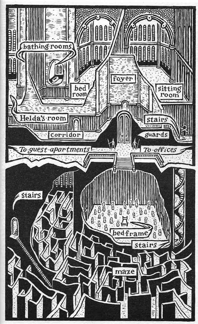
What's in a map?
For all Robert Louis Stevenson's opinions on other artists illustrating his works it is fascinating to note that he wrote Treasure Island as a direct response to a map he painted of the island in question. In this case the image is a prerequisite of the text.


Examining the map from The Hobbit, illustrated by the author J. R. R. Tolkien.
The Hobbit, while written by its author as a children's book, is widely accepted as a novel for all ages. It is not particualary modern (1937) but is still hugely relevant and extremely popular and successful, this almost de-ages it. (Helped by the new movie adaptation.)
This map like the one in Treasure Island is unique because it is a replica of that which is described in the narrative. It is not merely a map of the land in the narrative giving us a 'proleptic' look ahead in the story (like those in LotR) but it plays a part as an actual prop that the characters are in possession of. This is important in its inclusion of the reader in the story, it is almost as if they have joined the quest. We see what the characters see.
Here the maps role in the narrative is paramount.
" On the table in the light of a big lamp with a red shade he spread a
piece of parchment rather like a map.
"This was made by Thror, your grandfather, Thorin," he said in answer
to the dwarves' excited questions. "It is a plan of the Mountain."
"I don't see that this will help us much," said Thorin disappointedly
after a glance. "I remember the Mountain well enough and the lands
about it. And I know where Mirkwood is, and the Withered Heath where
the great dragons bred."
"There is a dragon marked in red on the Mountain," said Balin, "but
it will be easy enough to find him without that, if ever we arrive there."
"There is one point that you haven't noticed," said the wizard, "and
that is the secret entrance. You see that rune on the West side, and the
hand pointing to it from the other runes? That marks a hidden passage to
the Lower Halls." (Look at the map at the beginning of this book, and you
will see there the runes in red.)
"It may have been secret once," said Thorin, "but how do we know
that it is secret any longer? Old Smaug had lived there long enough now
to find out anything there is to know about those caves."
"He may-but he can't have used it for years and years."
"Why?"
"Because it is too small. 'Five feet high the door and three may walk
abreast' say the runes, but Smaug could not creep into a hole that size,
not even when he was a young dragon, certainly not after devouring so
many of the dwarves and men of Dale."
The map can be seen in both the Hobbit and Fellowship of the Ring movies:
"This book, with the help of maps, does not need any illustrations it is good and should appeal to all children between the ages of 5 and 9." -Rayner Unwin aged 10. (Son of Stanley Unwin, publisher of The Hobbit, 1936.)
As well as designing the maps for his middle earth mythology, Tolkien is the sole illustrator throughout the novel, cover to cover. I'd like to look into this in more detail later, at how this influences the reader's perception of the text and at the skills of the author fully realising his own text through illustrations.
On being asked if the american edition of the hobbit might be published using 'some good American artist', Tolkien responds: " I am divided between knowledge of my own inability and fear of what american artists (doubtless of admirable skill) might produce." Tolkien's illustrations are praised by critic Margery Fisher for being; '...not self-consciously naive, they put into visual form the kind of magic world in which a child might well have imagined.' The illustrations undoubtedly work and have a style which, mainly through the maps and book covers, have become inseparable from Middle Earth.
One one thing Tolkien was adamant on; "In any case I agree that all the illustrations ought to be done by the same hand: four professional pictures would make my own amateurish productions look rather silly." -The art of the Hobbit by Wayne G. Hammond & Christina Scull, 2011, Introduction.
This brings up another issue to take note of: What happens when a series of books, continuing a single story or linked stories are illustrated by different people, with different styles and therefore outcomes. Does your response to the narrative change?
Examining the fiction works of Kirstin Cashore.
A case of (map) illustrator reassignment occurs in the Graceling trilogy, (admittedly a series aimed at the mature young adult) and although I hadn't noticed it entirely because I read the books so far apart because of publishing dates, if I were to read them in succession as intended I feel the sudden artistic change would definitely alter the way in which I read them.
The first book in the series, Gracling, is accompanied by this carefully penned map, illustrated to look like a map that might be found within the narrative.


Cashore documents her working relationship with Schoenherr and want for illustrations on her blog here.
Examining the maps of the 'A Song of Ice and Fire' series.
These maps from the second book 'A Clash of kings' in George R.R. Martin's Song of Ice and Fire series illustrate the land of Westeros in which the majority of the story takes place.

Once again each map is decorative in a style such that it could be a relic of the world it depicts therefore drawing us into the narrative and handing us a physical piece of the fiction.
It is less pictorial than those already examined and has a more clinical approach, perhaps distancing the reader slightly, it does however present a clear visualisation of the locations.
What is important about this map is that it give us a sense of the scale and distance we are witnessing and experiencing in the narrative. In reading the text we discover that it takes numerous months to travel from 'Winterfell' in the north to 'Kings Landing' in the south, neither of which are either very southern or northern when in contrast to what the map shows.
As well as helping us understand the current narrative the map also allows us to understand the history presented in the text and the political 'map' and cultural differences of the characters.
Once again locations of key interest and import are revealed in the choice of maps, foreshadowing future events and invoking suspense as to when and what making it a proleptic illustration.


When does a map become an illustration? Its role within the text is hugely important, if not just as important as a classic illustration. The map lets us visualise not only the scene's themselves (up to a point) but the general location of the action:
"The map that readers find inserted in Treasure Island does not function like traditional examples of cartography outside the text nor like the map vied over by characters in the text. Stevenson’s map signifies or “illustrates” actions and places within the narrative; readers use it not to locate something nor find their way outside the text but to visualize described events, as is the case with most illustrations.
Stevenson’s map also exceeds the typical illustration; not limited to a single scene, it functions as a pictorial table of contents, helping readers navigate multiple chapters to see what will happen next and where."
That the map is placed at the start of the book is an incentive to would be reader to engage in the text. It offers the "... the strange incidents, the clearness and mystery, the story told and still remaining unknown" referred to by Stevenson earlier. While this sort of 'illustration' does not give away the plot before the novel has been read as is the danger with 'representational' illustrations, it presents the reader with a point of reference and invokes intrigue as to what will happen 'on the island' and where.

"Its embodiment of the narrative elevates the map beyond cartography to, specifically, illustration because the map's embedded story reveals a close relationship between this image and the corresponding narrative."
As a catalyst to the composition, the map functions as a radical example of 'proleptic' illustration (Mary Elizabeth Leighton & Lisa Surridge) which 'anticipates the events of the verbal plot to follow.'
The map, since drawn by Stevenson himself also allows him to "Defend his reputation as the author of authentic fiction."
"Stevenson juxtaposes textual pastiche with graphic innovation; in contrast to the text, the map appears original and impossible to duplicate, giving Stevenson a basis for differentiating himself as the author-illustrator of a unique imagetext."
While in contemporary times I would not see this a much of an issue we must remember that Stevenson was concerned that his work would be viewed as common popular fiction. That he also came up with the catalyst for the narrative: the map, would appear to make his work weigh more in favour of a work of 'high art' and of note rather than mere popular fiction.
All the World's a Stage...
Many contemporary fantasy novels that are not illustrated throughout the main body of the book include maps alongside their contents pages or in their appendices. Of those that I have found the huge majority appear to be fantasy fiction and I wonder if just the mere presence of a map would put someone off from reading the book if they were not a generally a fan of fantasy. (The same can be said for illustration in general)

Examining the map from The Hobbit, illustrated by the author J. R. R. Tolkien.
The Hobbit, while written by its author as a children's book, is widely accepted as a novel for all ages. It is not particualary modern (1937) but is still hugely relevant and extremely popular and successful, this almost de-ages it. (Helped by the new movie adaptation.)
This map like the one in Treasure Island is unique because it is a replica of that which is described in the narrative. It is not merely a map of the land in the narrative giving us a 'proleptic' look ahead in the story (like those in LotR) but it plays a part as an actual prop that the characters are in possession of. This is important in its inclusion of the reader in the story, it is almost as if they have joined the quest. We see what the characters see.
Here the maps role in the narrative is paramount.
" On the table in the light of a big lamp with a red shade he spread a
piece of parchment rather like a map.
"This was made by Thror, your grandfather, Thorin," he said in answer
to the dwarves' excited questions. "It is a plan of the Mountain."
"I don't see that this will help us much," said Thorin disappointedly
after a glance. "I remember the Mountain well enough and the lands
about it. And I know where Mirkwood is, and the Withered Heath where
the great dragons bred."
"There is a dragon marked in red on the Mountain," said Balin, "but
it will be easy enough to find him without that, if ever we arrive there."
"There is one point that you haven't noticed," said the wizard, "and
that is the secret entrance. You see that rune on the West side, and the
hand pointing to it from the other runes? That marks a hidden passage to
the Lower Halls." (Look at the map at the beginning of this book, and you
will see there the runes in red.)
"It may have been secret once," said Thorin, "but how do we know
that it is secret any longer? Old Smaug had lived there long enough now
to find out anything there is to know about those caves."
"He may-but he can't have used it for years and years."
"Why?"
"Because it is too small. 'Five feet high the door and three may walk
abreast' say the runes, but Smaug could not creep into a hole that size,
not even when he was a young dragon, certainly not after devouring so
many of the dwarves and men of Dale."
- The Hobbit, 1995 edition.
Here the parts of the map are described and explained, you get a real sense of involvement as you examine the map whilst Gandalf points to areas of it.What I find fascinating is Tolkien's addition of, "(Look at the map at the beginning of this book, and you will see there the runes in red.)". This is almost not surprising in the context of the book, it often reads like the bedtime story it was intended as if read out load by a parent. That direct reader/story teller relationship once again heightens our sense of involvement and it directs and demands our attention of the map.
"This book, with the help of maps, does not need any illustrations it is good and should appeal to all children between the ages of 5 and 9." -Rayner Unwin aged 10. (Son of Stanley Unwin, publisher of The Hobbit, 1936.)
As well as designing the maps for his middle earth mythology, Tolkien is the sole illustrator throughout the novel, cover to cover. I'd like to look into this in more detail later, at how this influences the reader's perception of the text and at the skills of the author fully realising his own text through illustrations.
On being asked if the american edition of the hobbit might be published using 'some good American artist', Tolkien responds: " I am divided between knowledge of my own inability and fear of what american artists (doubtless of admirable skill) might produce." Tolkien's illustrations are praised by critic Margery Fisher for being; '...not self-consciously naive, they put into visual form the kind of magic world in which a child might well have imagined.' The illustrations undoubtedly work and have a style which, mainly through the maps and book covers, have become inseparable from Middle Earth.
One one thing Tolkien was adamant on; "In any case I agree that all the illustrations ought to be done by the same hand: four professional pictures would make my own amateurish productions look rather silly." -The art of the Hobbit by Wayne G. Hammond & Christina Scull, 2011, Introduction.
This brings up another issue to take note of: What happens when a series of books, continuing a single story or linked stories are illustrated by different people, with different styles and therefore outcomes. Does your response to the narrative change?
Examining the fiction works of Kirstin Cashore.
A case of (map) illustrator reassignment occurs in the Graceling trilogy, (admittedly a series aimed at the mature young adult) and although I hadn't noticed it entirely because I read the books so far apart because of publishing dates, if I were to read them in succession as intended I feel the sudden artistic change would definitely alter the way in which I read them.
The first book in the series, Gracling, is accompanied by this carefully penned map, illustrated to look like a map that might be found within the narrative.

The map, placed in the front end sheets demands our attention as soon as we open the book. We can already see that presidency is given to 'Monsea' and can thus deduce that an important part of the narrative will be played out there. That the map is not of an island but of a peninsular of land is also of note and sets us up for the mystery of what lies beyond the mountains.
We are also presented with the crests of each 'kingdom' on the map which is something that doesn't happen in any of the later books. While little can be decoded from the crests on first glance there are obvious signs including swords representing kingdoms more akin to war and attacking and those of turrets and walls representing neutrality and defence.
The narrative revolves around the politics and relationships between each kingdom with the map clarifying and explaining the alliances and wars.
The style of illustration, decorative and delicate resonate with the fantasy stereotype and quickly identify the texts genre.
The second books leading map illustrated by Jeffery C. Mathison:

This map for the second novel in the trilogy is distinctly different from the first. Gone are the decorative boarders and titles that make it look like a map straight out of the fantastical libraries described in the narrative and the crests belonging to each land. Instead the map is more matter of fact. While it could still be an extract from the narrative, with its spiky fonts and key it feels much more like it is there just for the reader to make clearer the written narrative.
What this map does do is reveal a key narrative twist; the land from the first book in the series and that in this book are connected, divided only by an impassible mountain range. This is quite an important point in the narrative and for the entire trilogy so it surprises me that the map, placed before the novel even begins, reveals this. The characters in both stories are oblivious to this fact and while this gives the reader an omniscient stance and creates dramatic irony I can't help feeling like this gives the game away too soon. Obviously this heavily influences our reading experience, for better or worse is personal opinion although it does keep the expectation and suspense of 'discovery' high and the pace of the book going.
The third book published a full three years after the first two is wholly different in its illustration approach. It is this book that has the most experience changing illustration style in my opinion.
Illustrated by Ian Schoenherr.

While the change of illustrator between the fist two books are barely noticeable unless the reader is specifically looking, the change in the third and final book is striking and highly apparent.
Not only does the map style change from delicate ink lines to brash, strong woodcut style inks but there are additional maps of interiors and palaces included as well as ornamental chapter openers and chapter headers, all of which dramatically change the way the narrative is read.
While I personally think the illustrations are beautiful and the authors willingness to be illustrated fantastic, I also want to cast a critical eye on the pairing.
The feel of the book, when compared to its two predecessors is completely different, and while this has a huge amount to do with the story and main character from who's viewpoint the book is told (and that my copy is a hefty 550 page hardback compared to my other paperbacks)I feel the illustrations have a large part to play also.
The book feels much younger in tone and which is odd for its violent and sensitive content, this I feel is invoked and reflected by the style of illustration used.
I'm not saying it is inappropriate because it sits wonderfully with the text in the guise of a relic found in the libraries the main character often inhabits, only that it can often work against the text as an example of mature young adult fiction. At times it is almost mimics fairy tale illustration.
There could however be something in this, a juxtaposition of dark and moody images in a nostalgically youthful style set against the horrors and wonders of the world the text creates. Also the role of story telling within the narrative is important and so may be reflected in the images.
It's difficult to dissect this book since I love and admire the illustrations so much, I just feel that they 'youthen' its feel and perhaps therefore its (age) appeal. This is exactly the conclusion I didn't want to draw as I'm arguing the case of the illustrated adult novel. But however much I love the dual discourse I cannot ignore the fact the illustrations in this book make me aware, in a niggling way, of its young readership appeal and that it is in a different spectrum to the first two of the trilogy. (Which since it is a good book should deter me yet it's just there like an annoying itch.)


What I do love about the extra maps in this book, asides from their engrossing detail and ability to guide your envisionment of the 'location', is the addition of a final map of the 'Known World'. This comes at the very end of the book and is not easily noticed until studied after the novel has concluded, which is paramount because it illustrates a huge point in the narrative when all the characters from the three books come together and realise the existence of each others lands. Were this to come at the beginning or even 'amongst' the book the the plot would have been ruined and the way in which the narrative read dramatically altered.

Examining the maps of the 'A Song of Ice and Fire' series.
These maps from the second book 'A Clash of kings' in George R.R. Martin's Song of Ice and Fire series illustrate the land of Westeros in which the majority of the story takes place.

It is less pictorial than those already examined and has a more clinical approach, perhaps distancing the reader slightly, it does however present a clear visualisation of the locations.
What is important about this map is that it give us a sense of the scale and distance we are witnessing and experiencing in the narrative. In reading the text we discover that it takes numerous months to travel from 'Winterfell' in the north to 'Kings Landing' in the south, neither of which are either very southern or northern when in contrast to what the map shows.
As well as helping us understand the current narrative the map also allows us to understand the history presented in the text and the political 'map' and cultural differences of the characters.
Once again locations of key interest and import are revealed in the choice of maps, foreshadowing future events and invoking suspense as to when and what making it a proleptic illustration.

Maps by James Sinclair.
In conclusion:
On the pure role of the map to influence our reaction to the text it is clear to me that they are not merely images of locations or the lie of the land but important, crucial and noteworthy 'illustrations'. They act as 'in book' illustrations do, guiding and assisting the narrative, evoking suspense and drama and foreshadowing plot to come.

Do Pictures Pirate Text?
What I liked most about the interviews with Roald Dahl and W.D. Snodgrass was their apparent willingness and enthusiasm to have their work illustrated and engage in the writer/artist relationship. (Which is always nice!)

"As another medium for circulating the narrative, illustrations also deserve our attention because of their proliferation and Stevenson's preoccupation with them. In his account of writing Treasure Island, Stevenson envisions his map of the island as the first illustration and as resistant to reproduction.
He worries that artists can devalue his text through inaccurate imitation or revision. Both sources reveal that Stevenson values illustration for improving the novel's sales but also is concerned they contribute negatively to it's status as popular fiction."
Stevenson was still obviously concerned with how the dual discourse of text and image would read in regards to his story but also how it would be received publicly. It's interesting that he doesn't want (bad) illustration to devalue his work to a piece of common popular fiction when in contemporary times the same might be said for illustration in adult fiction to lower the expectation of the texts intelligence or age of its readership.
The dangers and difficulties with a writers work being illustrated are discussed here. From the authors point of view his work should to be key in visualising. The illustrations must compliment but not steer the readers reception and response to the text.
 As examined earlier (looking at comics) the primary danger when the book is picked up is not only that the illustrations put off a reader but that the book in Stevenson's words, "be skimmed, swift as a racer, the points seized, the story drained of such cheap virtue as it possesses in five minutes instead of in the tedium of several hours of study."
While this can work well in attracting the audience, invoking interest in the mystery ahead, the illustrations should not tell the whole narrative but give a taste:
"There is nothing more delightful than the first skimming of a storybook with pictures: the faces, the costumes, the strange incidents, the clearness and mystery, the story told and still remaining unknown."
'Expert illustrators must remain loyal to the text, while simultaneously adding their own style: "A picture in a story book must be something more than a mere pretty picture...it should narrate. It should be the handmaiden of the text, competing with another accent and the stamp of a different mind."
Stevenson acknowledges a want and need for illustration but is also wary of it 'pirating' the text. "Illustrations contribute to the text's popularity but pressure the author to create the more memorable versions of the characters and events. Of greater concern to Stevenson are poor quality illustrations that fail to convey the essence and depth of the written narrative."
Stevenson's pirates are unique to us in that they are not the swashbuckling pirates we generally meet in story books and blockbuster movies but are are decaying and weather beaten. And yet as the book is illustrated and re-illustrated as time goes by those characters are generalised into a stereotype we can all recognise.
"The emphasis on deterioration suggests Stevenson is self-conscious that he employs a timeworn stereotype. Ironically, however, his pirates’ ruined forms set them apart from their predecessors (and many of their successors), who typically attract readers with their glamorous, sturdy figures.

That the text is not only illustrated but re-illustrated is an interesting fact in itself.
The illustrations tend less to draw upon the narrative and Stevenson's descriptions and more upon copying each other and reflecting the fashions of the day.

This paper looking at the role of illustration in the original publications of Robert Louis Stevenson's Treasure Island show another side to this willingness. It is quite opposite to our times (as a general rule) but Stevenson wanted his work illustrated because it would 'sell better'.
There are contemporary examples of books being sold on the credit of their illustrations, the folio society being the main one, however a book aimed at the best-sellers list would generally be wary of a surplus of illustrations due to current conventions where illustration is seen as somewhat childish or archaic.
There are contemporary examples of books being sold on the credit of their illustrations, the folio society being the main one, however a book aimed at the best-sellers list would generally be wary of a surplus of illustrations due to current conventions where illustration is seen as somewhat childish or archaic.
The people of Stevenson's day meanwhile would be more than happy and attracted to a book rich in the visuals presented here.

"As another medium for circulating the narrative, illustrations also deserve our attention because of their proliferation and Stevenson's preoccupation with them. In his account of writing Treasure Island, Stevenson envisions his map of the island as the first illustration and as resistant to reproduction.
He worries that artists can devalue his text through inaccurate imitation or revision. Both sources reveal that Stevenson values illustration for improving the novel's sales but also is concerned they contribute negatively to it's status as popular fiction."
Stevenson was still obviously concerned with how the dual discourse of text and image would read in regards to his story but also how it would be received publicly. It's interesting that he doesn't want (bad) illustration to devalue his work to a piece of common popular fiction when in contemporary times the same might be said for illustration in adult fiction to lower the expectation of the texts intelligence or age of its readership.
The dangers and difficulties with a writers work being illustrated are discussed here. From the authors point of view his work should to be key in visualising. The illustrations must compliment but not steer the readers reception and response to the text.

While this can work well in attracting the audience, invoking interest in the mystery ahead, the illustrations should not tell the whole narrative but give a taste:
"There is nothing more delightful than the first skimming of a storybook with pictures: the faces, the costumes, the strange incidents, the clearness and mystery, the story told and still remaining unknown."
'Expert illustrators must remain loyal to the text, while simultaneously adding their own style: "A picture in a story book must be something more than a mere pretty picture...it should narrate. It should be the handmaiden of the text, competing with another accent and the stamp of a different mind."
Stevenson acknowledges a want and need for illustration but is also wary of it 'pirating' the text. "Illustrations contribute to the text's popularity but pressure the author to create the more memorable versions of the characters and events. Of greater concern to Stevenson are poor quality illustrations that fail to convey the essence and depth of the written narrative."
Stevenson's pirates are unique to us in that they are not the swashbuckling pirates we generally meet in story books and blockbuster movies but are are decaying and weather beaten. And yet as the book is illustrated and re-illustrated as time goes by those characters are generalised into a stereotype we can all recognise.
"The emphasis on deterioration suggests Stevenson is self-conscious that he employs a timeworn stereotype. Ironically, however, his pirates’ ruined forms set them apart from their predecessors (and many of their successors), who typically attract readers with their glamorous, sturdy figures.
The illustrations frequently
ignore Stevenson’s thorough character sketches by instead replicating these
stereotypes and inscribing them back into the narrative. "
Once more it is down to the author to "create the more memorable versions of characters and events"

That the text is not only illustrated but re-illustrated is an interesting fact in itself.
The illustrations tend less to draw upon the narrative and Stevenson's descriptions and more upon copying each other and reflecting the fashions of the day.
"The value of otherwise acclaimed work fades, as different artists’ versions of the same crucial scenes, when viewed collectively, appear to lack innovation."
On the illustration below: "The woodcut employs a common
approach to representing criminals: whether they feature pirates or highwaymen,
among others, such illustrations send a clear message that their subjects are
based on a generic figuration of “the outlaw.”
Subscribe to:
Posts (Atom)